Boston Consulting Group Presentation: Board-Ready Slide Guide
In 2025, AI-related work generated roughly a quarter of BCG's revenue, a signal of how much complexity today's decks must translate into clear choices. That shift raises the bar for anyone preparing strategic slides, because busy leaders now expect analysis that reads instantly. When you study how a Boston Consulting Group presentation is built, the lesson is rarely about aesthetics; it is about turning dense evidence into a decision. If you want a faster starting point, our strategy slides for consulting presentations apply the same structured logic.
The recurring pattern across public consulting material is consistent: each slide answers a specific question, proves that answer visually, and cites its inputs. According to Bloomberg, that AI work brought about 25% of the firm's 2025 revenue, underscoring how much intricate data now flows into a single executive exhibit. The goal of this article is to help you reproduce that clarity in your own decks, whatever your brand or template.
What defines a consulting-grade BCG presentation
A slide in the BCG tradition is best understood as a visual argument. It carries one conclusion, states that conclusion in the title, and then proves it with a single dominant visual. Everything else on the surface, from color to spacing, exists to make that proof easier to read. This is why imitating a firm's logo or palette misses the point entirely. The transferable value lies in the communication discipline, not the trademark.
Consider the practical test that separates a strong exhibit from a weak one: can the reader state the point of the slide in a single sentence without narration? If the answer is no, the slide is doing too much or too little. A useful discipline is to write the decision question before opening any software. A topic such as "customer retention" is too broad, whereas "which segment should receive the retention budget next quarter" forces a specific, provable answer that becomes your working title.
Freshness of context also matters. The firm now positions technology heavily; BCG reported that tech- and AI-focused services represent more than 40% of its total revenue in 2025. That evolution shapes the content of modern strategy decks, but the underlying slide grammar has stayed remarkably stable for decades.
Action titles: from topic to answer
The single most important habit to adopt is the action title. Instead of labeling a slide with its subject, you write the finding and its implication directly in the headline. A title such as "market analysis" forces the reader to interpret the exhibit, while "industrial segments grow three times faster than consumer, creating the clearest entry wedge" tells the reader what to conclude before they study the chart.
A strong action title normally contains two elements: a specific finding and the implication that follows from it. It should never exaggerate beyond the data or prescribe an action the evidence cannot support. This is a matter of both persuasion and integrity, because an inflated headline collapses the moment a skeptical executive tests it against the numbers below.
When you chain these titles together, the headline row of your deck should read like a coherent storyline on its own. If someone skims only the titles and still understands the recommendation, your narrative structure is working. To see how this logic plays out in genuine decks, our analysis of what real consulting presentations reveal breaks down the patterns slide by slide.
Choosing the visual that proves your point
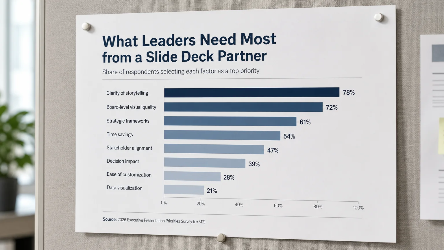
Once the answer is written, the next decision is which single visual proves it most efficiently. The temptation to reach for a complex chart because it looks analytical is a common trap. A sorted bar chart is often clearer than a bubble or Mekko chart, and clarity always outranks apparent sophistication.
Match the visual to the structure of the claim. When one segment is larger than the others, a sorted bar chart does the job. When a value changed because of several drivers, a waterfall chart makes the movement legible. When market share and market size both matter, a bubble or Mekko chart earns its complexity. When two dimensions determine priorities, a 2x2 matrix works, and when execution unfolds in stages, a timeline or roadmap communicates sequence best.
The sequence element deserves particular attention, because executives rarely approve a recommendation without understanding when it happens. If your deck argues for a phased rollout, a well-constructed timeline turns an abstract plan into a credible commitment. Our guide to timeline slide design for persuasive consulting decks shows how to keep those milestones readable rather than cluttered.
Design discipline, labels, and sources
Restraint is the defining aesthetic of a consulting-grade deck. You build on a neutral base and reserve a single accent color for the comparison that actually matters. When every series is saturated, nothing is emphasized, and the reader loses the thread. Decorative shapes, borders, icons, and gradients must remain subordinate to the evidence they surround.
Direct labeling is the companion habit. Legends force readers to decode colors before they understand the message, so wherever space allows you should label the important bar, line, segment, or quadrant directly, adding one concise callout to explain the implication. Use annotation for interpretation, not duplication; repeating every number in both a label and a paragraph adds noise without adding meaning.
Finally, source discipline is what separates a defensible exhibit from a decorative one. For every material chart, record the source organization, the dataset and period, the units and currency, any transformations, and the refresh date. Another analyst should be able to verify the exhibit without asking you. For a complementary view of layout conventions, review these Deloitte slide best practices (useful for BCG-style decks).
BCG versus McKinsey versus Bain: tendencies, not rules
Readers often ask how the three major strategy firms differ on slides. The honest answer is that client templates, individual authors, and publication formats create far more variation than most internet summaries admit. Still, some broad tendencies are observable in public material, and they are useful as reference points rather than strict specifications.
| Approach | Title treatment | Body treatment | Ready-made structure |
| Deckadence templates | Insight-led, editable action titles | Framework library with board-level visuals | Yes, for PowerPoint, Keynote and Figma |
| BCG style | Short, insight-led | Dominant chart or framework | Not publicly distributed |
| McKinsey style | Complete answer-first statement | Explicit written logic and structured evidence | Not publicly distributed |
| Bain style | Direct takeaway | Mix of evidence and practical actions | Not publicly distributed |
The practical takeaway is that all three prioritize answer-first titles and defensible evidence. Public BCG examples often feel more visually led, while public McKinsey examples tend to make the written logic more explicit. Rather than imitating any single house style, you adopt the shared discipline and apply it with your own brand and data.
Why AI is reshaping the modern strategy deck
The content flowing into strategy presentations has changed sharply, and the numbers make that clear. The BCG AI Radar 2026 found that corporations expect to roughly double their AI spending in 2026, from about 0.8% to about 1.7% of revenues. Decisions of that magnitude increasingly land on a single executive slide, which raises the stakes for clarity.
The tooling has shifted internally as well. According to Morningstar, nearly 4,000 BCG employees now actively develop and scale AI workflows through advanced coding and automation. For your own decks, generative tools can draft a slide structure quickly, but a human must still verify the recommendation, reconcile the chart to the source data, and confirm that the conclusion is not stronger than the evidence permits.
The safest workflow is to give an AI a decision, the underlying evidence, and explicit quality checks, then review the output against those checks before it reaches a boardroom. AI accelerates the production pass; it does not replace analytical judgment or accountability for what the slide claims.

Common mistakes to avoid
The most frequent error is copying branding instead of communication principles. A green accent and a consulting logo do not create a consulting slide. What transfers is the discipline: a clear answer, strong evidence, direct labels, and visible sources, applied with your own authorized brand.
Other recurring mistakes compound quickly. Writing a topic title forces the reader to interpret the exhibit rather than absorb the point. Choosing a complex chart for what is essentially a status update buries a simple message. Using saturated color everywhere destroys hierarchy, and omitting the source or the analytical step undermines credibility the moment someone probes.
A subtler trap is flattening the final slide into an image. A screenshot may look correct, yet it becomes expensive during review because nobody can edit it. Keep text, charts, tables, and shapes native whenever the recipient will need to revise them, so your deck remains a working document rather than a locked artifact.
Bringing the discipline together
Reproducing the strengths of a Boston Consulting Group presentation is not about mimicking a color or a font. It is about a repeatable method: define the decision, write the answer as the title, prove it with the simplest possible visual, label the insight directly, and cite every material input. When you apply that discipline consistently, your headline row tells the story on its own and your evidence withstands scrutiny. Start each slide from the question it must answer, resist the pull toward decorative complexity, and keep your files editable so the deck can evolve with the decision it supports.
Take action with Deckadence
If you are preparing a high-stakes deck and want to skip the blank-canvas struggle, you can begin from structures that already embody these principles. We build slide systems where the thinking shows as clearly as it reads, so your recommendation lands with executives on the first pass.
Our BCG-style consulting presentation (PowerPoint) pairs consulting-grade frameworks with board-level visuals and structured storytelling, giving you action titles, editable charts, and proven narrative structures. You keep full control of the content while gaining a refined, decision-ready foundation designed to align stakeholders and accelerate approvals.
Frequently Asked Questions
What makes a presentation feel like a BCG deck?
It is the communication discipline rather than the branding. Each slide carries one decision-relevant message, a concise action title, and the simplest chart that proves the point, with direct labels and a visible source.
What font does BCG use in its slides?
You should use the font required by your client or organization rather than chasing unsourced claims about internal templates. Consistency and readability matter far more than imitating any firm-specific typeface.
How is a BCG style different from a McKinsey style?
Public BCG examples often feel more visually led, while public McKinsey examples tend to make the written logic more explicit. Both approaches prioritize answer-first titles and defensible, verifiable evidence.
Can I create board-ready slides without designing from scratch?
Yes. Our strategic-thinking templates and slide systems provide consulting-grade frameworks and board-level visuals so you can focus on the argument instead of the layout, while keeping every element editable.
Can AI build a consulting-style slide reliably?
AI can draft the structure and the visual quickly, but a person must verify the recommendation, reconcile the chart to its data, and confirm the sources. Treat it as a production accelerator, not a substitute for judgment.