Deloitte Slides: Structure, Design and Best Practices 2026
Over half of senior executives treat presentation skills as a direct factor in leadership success, yet most decks still bury their central message under clutter. A well-built consulting deck does the opposite. The discipline behind Deloitte-style slides lies in structure: every slide carries one message and moves the audience one step closer to a decision. If you want reference points beyond one firm, you can study our McKinsey strategy slides examples to compare how top firms package their thinking.
Expectations have also shifted around speed. In 2026, the average time to build a ten-slide deck has fallen below two hours as artificial intelligence tools spread, according to recent presentation statistics. Faster production raises the bar on clarity: when everyone can generate slides quickly, the decks that win are the ones with disciplined structure and a message that stands on its own.
What defines the Deloitte presentation style
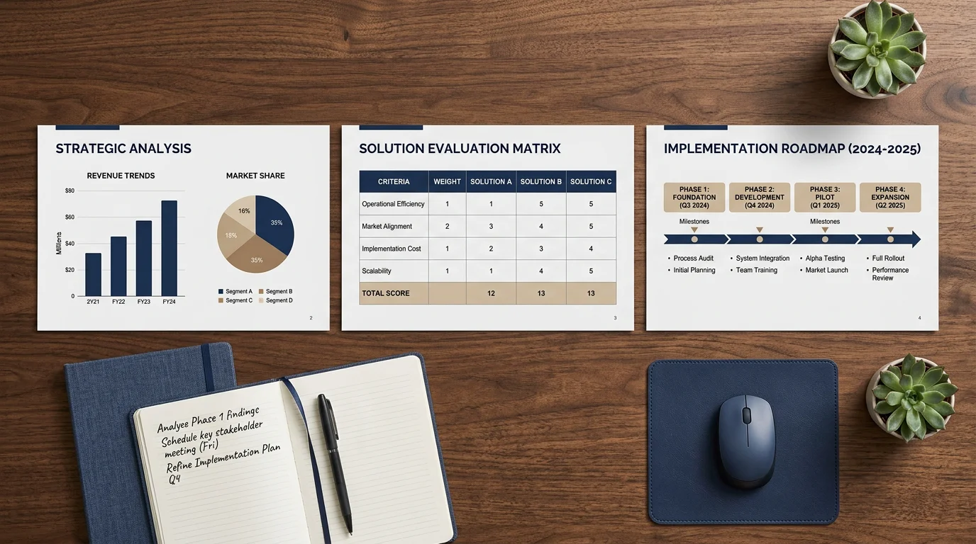
The phrase deloitte slides describes a professional design language built on clarity, precision, and restraint. Each slide is engineered to achieve one communication objective, and dense text areas are deliberately avoided. Layouts rely on generous whitespace, consistent branding, and purposeful visual assets rather than ornament.
The content follows an audience-first logic. It is tailored to stakeholder concerns and progresses logically from context toward recommendations and actionable outcomes. Tone stays professional yet accessible, and every design element serves comprehension rather than decoration. This is why consulting decks read as serious documents that can be both presented live and forwarded for later reading.

How Deloitte slides differ from McKinsey and BCG
All the major firms produce polished decks, but their design signatures diverge. Deloitte slides balance aesthetics and function, using branded colors and visuals to support the narrative and a strong emphasis on implementation. Minimalist, text-led layouts and rigorous frameworks are more associated with McKinsey, while elaborate visual storytelling is a hallmark of BCG. Understanding these contrasts helps you choose the right model for your own audience.
| Approach | Design signature | Ideal use |
|---|---|---|
| Deloitte | Clean, branded, whitespace-rich | Implementation and action plans |
| McKinsey | Minimalist, text-led, MECE structure | Strategic frameworks |
| BCG | Storytelling-focused visuals | Case-specific insights |
| Deckadence (our slide systems) | Board-ready design with built-in strategy frameworks | Board-level strategy decks in PowerPoint, Keynote, and Figma |
Our approach blends consulting-grade frameworks such as SWOT, PESTEL, and Porter's Five Forces with refined visuals, so the thinking shows as clearly as it reads. To see how a top firm packages reasoning in practice, review What real McKinsey presentations reveal before adapting a style to your own context.
The structural backbone of a Deloitte deck
A consulting deck is not a loose collection of slides. It follows a logical sequence, with each component serving a distinct role in the narrative. A typical structure runs from a title slide through an agenda, an executive summary, context, methodology, analysis, and next steps, closing with a conclusion and an appendix for supporting detail.
Many practitioners anchor this flow with the TIM framework: Topic, Intention, and Message. The topic sets the central subject, the intention defines the purpose (to inform, persuade, or propose), and the message distills both into an actionable recommendation. The executive summary matters most for senior stakeholders, since it condenses the problem, findings, and recommended actions into a format they can absorb in seconds.
Length adapts to purpose. Executive briefings often run thirty to forty-five minutes on high-level insight, while detailed client workshops stretch to sixty or ninety minutes with methodologies and implementation plans. Matching duration to audience is part of the discipline.
Why visual design carries the message
Design is not decoration; it determines whether an audience remembers your point and acts on it. Research shows the effect is measurable: audiences are 43% more likely to be persuaded when a presenter uses visual aids rather than words alone. Retention tells the same story, climbing from roughly 10% for verbal-only delivery to around 65% when visuals accompany the message.
This is why consulting decks lean on data visualization: charts, tables, and infographics that make complex findings accessible at a glance. The goal is not to look impressive but to compress weeks of analysis into a form a decision-maker grasps instantly. If you want the underlying reasoning, our explanation of why visuals work in slide decks covers how the brain processes structured imagery.
Building Deloitte-style slides yourself
Start with the storyline, not the slides. Sketch the overall flow on paper, or list only your slide titles and read them in sequence. If the titles alone tell a coherent story, the deck will follow. Then use action titles that state each slide's conclusion, for example "Costs fell 12% after consolidation," rather than a flat label like "Cost overview."
Consistency does the quiet work. Keep fonts, spacing, and chart styles uniform so the reader spends attention on the message instead of decoding the format. Artificial intelligence is accelerating this craft rather than replacing it: at McKinsey, an internal generative tool reportedly reaches 72% active use across the firm, with colleagues citing meaningful time savings. The judgment about structure and story, however, still comes from you.
Common mistakes to avoid
Three failures recur in weak decks. The first is excess text: dense paragraphs bury the point and drain attention. The second is decorative clutter, where effects and stray visuals undermine credibility. The third is a missing storyline, where individually competent slides never add up to a coherent argument.
The remedy is disciplined subtraction. Keep one message per slide, lead with the conclusion, and cut anything that does not advance the decision. Include clear data visuals, concise executive summaries, and a structured logical flow from problem to analysis to solution. When you are unsure whether an element belongs, ask whether it helps the audience decide; if not, remove it.
Turning structure into decisions
The value of Deloitte-style slides is not aesthetic polish for its own sake. It is a repeatable method for turning dense analysis into decisions: one message per slide, action titles that carry the argument, and visuals that make evidence instantly legible. Master the storyline first, enforce consistency second, and let design serve comprehension throughout. Do that, and your decks will read clearly whether you present them live or forward them to a stakeholder who was never in the room.
Take action with Deckadence
Studying strong consulting decks is one thing; producing them under a deadline is another. If you are preparing a board-level strategy presentation and need structure, frameworks, and refined visuals in one place, we can shorten the distance between your analysis and a decision-ready deck.
Our consulting-grade slide systems combine proven strategy frameworks with board-ready design across PowerPoint, Keynote, and Figma, so the thinking shows as clearly as it reads. To start from a professional foundation, download our McKinsey-style strategy presentation PPT and adapt it to your own audience and objectives.
Frequently Asked Questions
What is a Deloitte-style presentation?
It is a professional design approach built on clean layouts, branded consistency, and clear data visuals. Every slide carries one message and progresses logically from context to recommendation. The defining feature is a practical focus on implementation and actionable next steps.
How is a Deloitte deck different from a McKinsey deck?
Deloitte decks balance aesthetics with function and lean toward detailed implementation plans. McKinsey decks are often more minimalist and text-led, organized around rigorous frameworks such as MECE. Both prioritize data, but they emphasize different stages of the strategy conversation.
What slides should a consulting presentation include?
A standard sequence covers a title slide, agenda, executive summary, context, methodology, analysis, next steps, and conclusion. An appendix holds supporting data that would otherwise clutter the main narrative. Each component serves a distinct role in guiding the audience.
Can I build board-ready slides without a design background?
Yes, provided you start with the storyline and keep formatting consistent. Our strategic-thinking templates and framework library give you structured layouts and proven frameworks, so you focus on the message rather than on design mechanics. That reduces preparation time while keeping a professional standard.
What is an action title and why does it matter?
An action title states the conclusion of a slide instead of merely naming its topic. It lets a reader grasp your argument by scanning titles alone, even without your narration. This single habit sharpens the storyline and makes decks easier to forward and understand.