Ask any consultant why a chronology deserves its own slide, and the answer is persuasion. Visuals are not decoration; they change outcomes. Research summarized by presentation specialists suggests decks with visuals are markedly more convincing than words alone. A well-built McKinsey timeline slide harnesses that effect, compressing a tangle of dates into a clean, linear narrative that an executive audience can absorb in seconds. If you want the design logic behind such decks, our McKinsey presentation PPT guide lays out the foundations.
The stakes are high because senior audiences decide fast. According to Visme's presentation research, the average attention span on a single point on screen is only 47 seconds. A timeline slide either earns that attention or wastes it. The difference is rarely the data; it is the discipline of the design.
What a McKinsey timeline slide really is
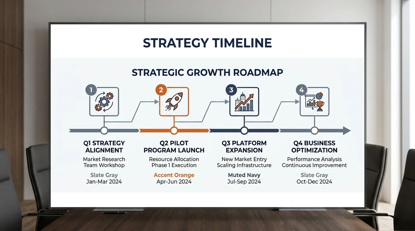
A timeline slide presents key events, milestones, or project phases in chronological order. The purpose is clarity: helping an audience see when things happened, or will happen, and how the sequence fits together. In practice, a mckinsey timeline slide follows a recognizable pattern used across top strategy firms, where the shared discipline is restraint rather than ornament.
Consultants reach for chronologies to handle a handful of recurring jobs. These include telling a company growth story, illustrating mergers and organizational changes, mapping the phases of a new initiative, and showing how a product evolved. Each case shares one trait: the message is the sequence, not the individual data point.
What separates the consulting version from a generic template is the title. Instead of a label reading "Timeline," a strong slide carries an action title stating the conclusion the chronology proves. The axis supports the argument; it does not become the argument.
Why a timeline slide persuades an executive room
Why does a simple axis carry so much weight? Because the brain processes structured visuals faster than paragraphs. Studies compiled by Piktochart report that combining verbal and visual communication can raise credibility and influence to around 43%, compared with roughly 17% for words alone. A chronology is one of the cleanest visual structures available.
Timelines also accelerate agreement. The same body of research notes that groups working with visual language reached consensus faster and cut meeting length by nearly a quarter. For a strategy team trying to align stakeholders around a phased plan, that efficiency is the entire point of the slide.
There is a rigor angle too. Academic work on visualization, such as a systematic literature review on business process visualizations, points to the "data-ink ratio" principle: effective visuals maximize the information conveyed and minimize decorative clutter. A disciplined timeline is a textbook application of that idea. If you want the deeper reasoning, we explain it in Why visuals work (for timeline slide design).
The anatomy of a board-ready chronology
Picture a slide with a single horizontal line, four milestone markers, and a headline that reads like a sentence. That is the skeleton. Everything else is subtraction. The consulting pattern favors few milestones, clear labels, and one visual axis so the eye never has to hunt.
Consider the essential components:
- Action title: a full-sentence takeaway, not the word "Timeline." It states what the sequence proves.
- One axis: a single, consistent time scale that anchors every marker.
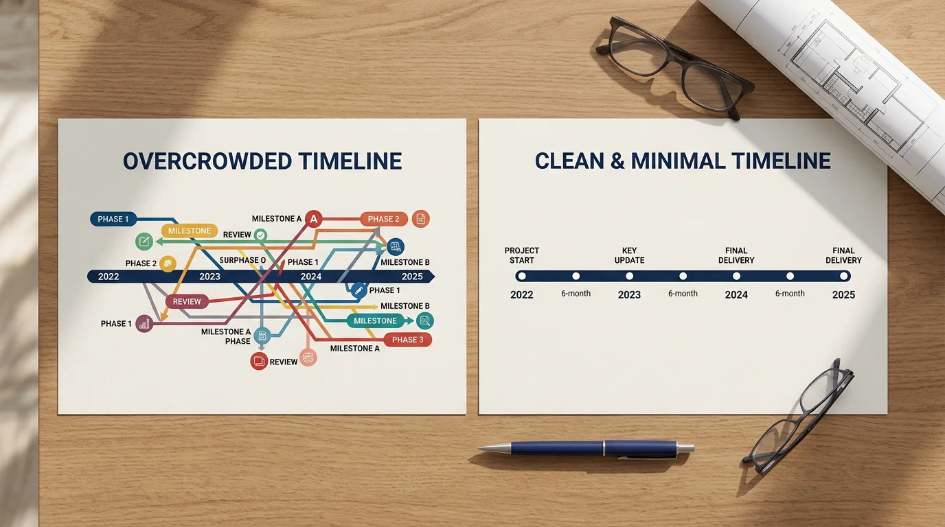
- Selective milestones: only the events that advance the argument, typically three to six.
- Consistent labeling: parallel phrasing and equal visual weight for each point.
- White space: deliberate emptiness that separates elements and reduces fatigue.
This mirrors the wider McKinsey deck philosophy of minimalist, consistent design, where clean layouts and a limited palette guide the reader's eye. The timeline is simply that philosophy applied to time. For a broader view of how these principles shape real client decks, see What real McKinsey presentations reveal about strategy.
Timeline versus roadmap: choosing the right tool
A frequent error is confusing a timeline with a roadmap. They look similar and serve different goals. A timeline emphasizes dates and sequence: what happened or will happen, and when. A roadmap focuses on the strategic journey toward long-term objectives and tolerates far less date precision.
The decision rule is simple. If your message is chronology, build a timeline. If your message is direction, grouping initiatives into phases and priorities, build a roadmap. Choosing the wrong format is common, and it dilutes the point of the slide.
| Criterion | Timeline slide | Roadmap slide |
|---|---|---|
| Primary focus | Dates and sequence | Strategic direction |
| Date precision | High | Lower, phase-based |
| Best for | Growth stories, M&A, product evolution | Priorities, dependencies, long-term vision |
| Ready-made design | Our board-level slide systems and strategy frameworks cover both, tailored for decision-makers | |
Common mistakes that weaken a timeline slide
Even seasoned presenters sabotage their own chronologies. The failures are predictable, which makes them easy to avoid once you name them.
- Overcrowding: packing every date onto one axis buries the message under detail.
- Inconsistent time scales: uneven spacing distorts how the audience perceives duration and momentum.
- Forcing parallel work into a line: when activities run simultaneously, a single linear layout misleads.
- Tactical clutter: project-management detail belongs in a tracking tool, not a board slide.
Each mistake shares a root cause: treating the slide as a data dump rather than an argument. Guidance from Lumivero's presentation guide reinforces the fix, recommending you identify only three or four takeaways you want an audience to remember. A timeline should carry a single takeaway, expressed in its title.
Building your own timeline slide efficiently
Crafting a strong chronology from scratch takes time, and reinventing the layout for every deck is wasteful. A library of flexible, consulting-style templates removes that friction, letting you focus on the message instead of the geometry. That is where a structured slide system earns its keep.
Start with the takeaway, not the timeline. Write the action title first, then select only the milestones that support it. Choose one consistent scale, apply parallel labels, and protect your white space. When you need board-ready building blocks, our strategy-thinking templates and framework library give you tested structures for growth stories, phasing, and competitive narratives, all built for PowerPoint, Keynote, and Figma.
Bringing your chronology to life
A McKinsey timeline slide succeeds when it stops trying to show everything and commits to proving one thing. Lead with an action title, keep a single axis, select only the milestones that carry the argument, and defend the white space around them. Match the format to the message: a timeline for sequence, a roadmap for direction. Master that discipline, and a chronology becomes one of the most persuasive slides in any strategy deck, turning a wall of dates into a decision your audience can make with confidence.
Take action with Deckadence
You now know what separates a persuasive chronology from a cluttered one. The next step is applying that discipline under deadline pressure, when you are aligning stakeholders and preparing to command the room. That is precisely the moment a proven system saves hours and protects your credibility.

We build consulting-grade slide systems that combine strategy frameworks, structured storytelling, and board-level visuals for PowerPoint, Keynote, and Figma. Explore our McKinsey strategy slides to turn complex timelines and priorities into clear, decision-ready narratives that move people to act.
Frequently Asked Questions
What makes a timeline slide look like McKinsey's?
The signature traits are restraint and a strong headline. You use one visual axis, a small set of milestones, consistent labels, and an action title that states what the sequence proves rather than a label reading "Timeline." A limited color palette and generous white space complete the look.
How many milestones should a timeline slide contain?
Aim for a handful, typically three to six, so the message stays legible. Overcrowding is one of the most common mistakes, because packing in every date buries the point. If you have more events, split them across slides or promote only the ones that advance your argument.
What is the difference between a timeline and a roadmap?
A timeline emphasizes dates and sequence, showing what happened or will happen and when. A roadmap focuses on the strategic journey toward long-term goals and tolerates less date precision. If your message is chronology, use a timeline; if it is direction, use a roadmap.
Why should the slide title not just say "Timeline"?
Because a label wastes your most valuable line of text. An action title delivers the takeaway immediately, telling the audience what the chronology proves. This aligns with the wider consulting principle of leading every slide with its conclusion.
Can I build a professional timeline slide without a designer?
Yes. Starting from a structured template removes the layout guesswork so you can focus on the message. Our strategy-thinking templates and framework library provide board-ready timeline structures for PowerPoint, Keynote, and Figma, letting you produce a polished chronology quickly.