How to Build McKinsey Strategy Slides That Win Decisions
Roughly 40% of executives report feeling highly burdened by the sheer volume of information crossing their desks each week. In that setting, a deck either earns a decision within minutes or gets quietly set aside. If you want your recommendations to land with a board, our Strategic plan template pairs that discipline with a ready structure so you begin from clarity, not a blank canvas.
The appeal of strategy slides in the McKinsey tradition is not decoration; it is clarity under pressure. According to Harvard Business Review research, 40% of executives and 30% of managers feel highly burdened by information. Decks built on structured thinking cut through that noise and shorten the path to a yes.
What Makes McKinsey Strategy Slides Distinct
McKinsey slides are recognizable for a reason: they are engineered for decisions, not for information sharing. When people study McKinsey strategy slides, they notice that every deck answers three questions an executive silently asks. What is the recommendation? Why should I believe it? What should I do next?
The firm has refined this method since its founding in 1926, prioritizing structured thinking and executive-level communication over ornamental design. The result is a consistent, no-frills style. Each slide is optimized for scannability, comprehension, and retention, because the audience is time-starved and decision-focused.
This is why the approach translates well beyond consulting. Whether you present a turnaround plan or a growth thesis, the same discipline keeps your board-level presentation tight and persuasive.
The Frameworks Beneath Every Slide
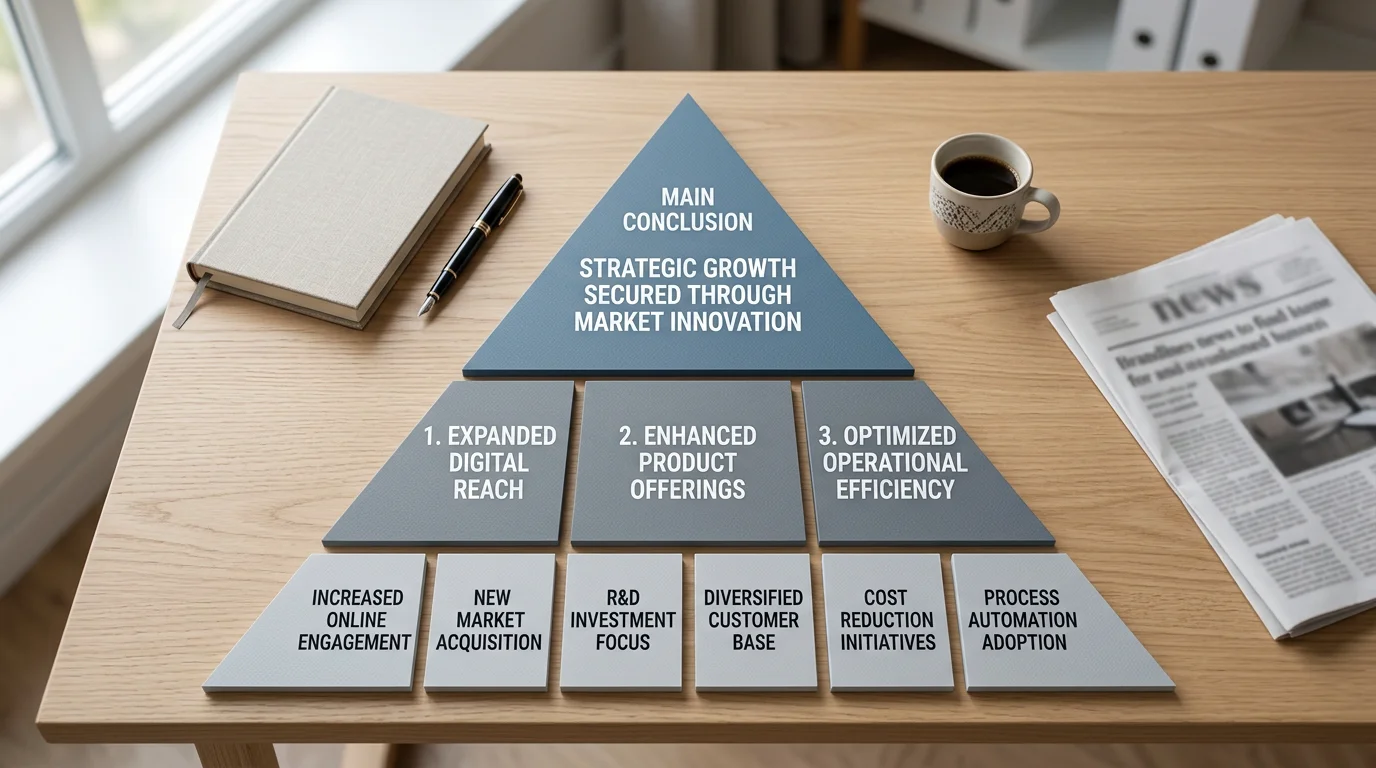
Three frameworks give McKinsey decks their backbone. The first is the Pyramid Principle, developed by Barbara Minto during her years at the firm. It inverts ordinary communication: you lead with the answer, then present three to five supporting arguments, each grounded in evidence.
The influence is hard to overstate. The book that codified the method, as one ex-McKinsey account notes, has sold millions of copies and shaped how top firms structure their work. The second framework, MECE (Mutually Exclusive, Collectively Exhaustive), ensures your categories neither overlap nor leave gaps.
The third is the SCR storyline (Situation, Complication, Resolution), which builds narrative tension before delivering the recommendation. Together, these tools turn a pile of analysis into an argument an executive can follow. To apply them to a phased plan, our Business roadmap template maps each stage against the storyline you are building.
Action Titles and the One-Message Rule
Consider two slide titles. "Revenue trends" tells the reader nothing. "Revenue declined 8% due to premium segment contraction" tells the whole story. The second is an action title, a complete sentence that states the takeaway, and it is a signature of the McKinsey style.
Action titles matter because most people do not read carefully. Nielsen Norman Group research found that 79% of people scan pages rather than read word for word. When your titles read as a coherent argument on their own, a skimming executive still grasps your case.
The companion rule is one message per slide. Working memory holds only a few items at once, so a slide carrying two competing ideas forces the audience to choose which to follow. If you are tempted to combine two points, build two slides instead and let white space do its work.
The Visual System That Carries the Argument
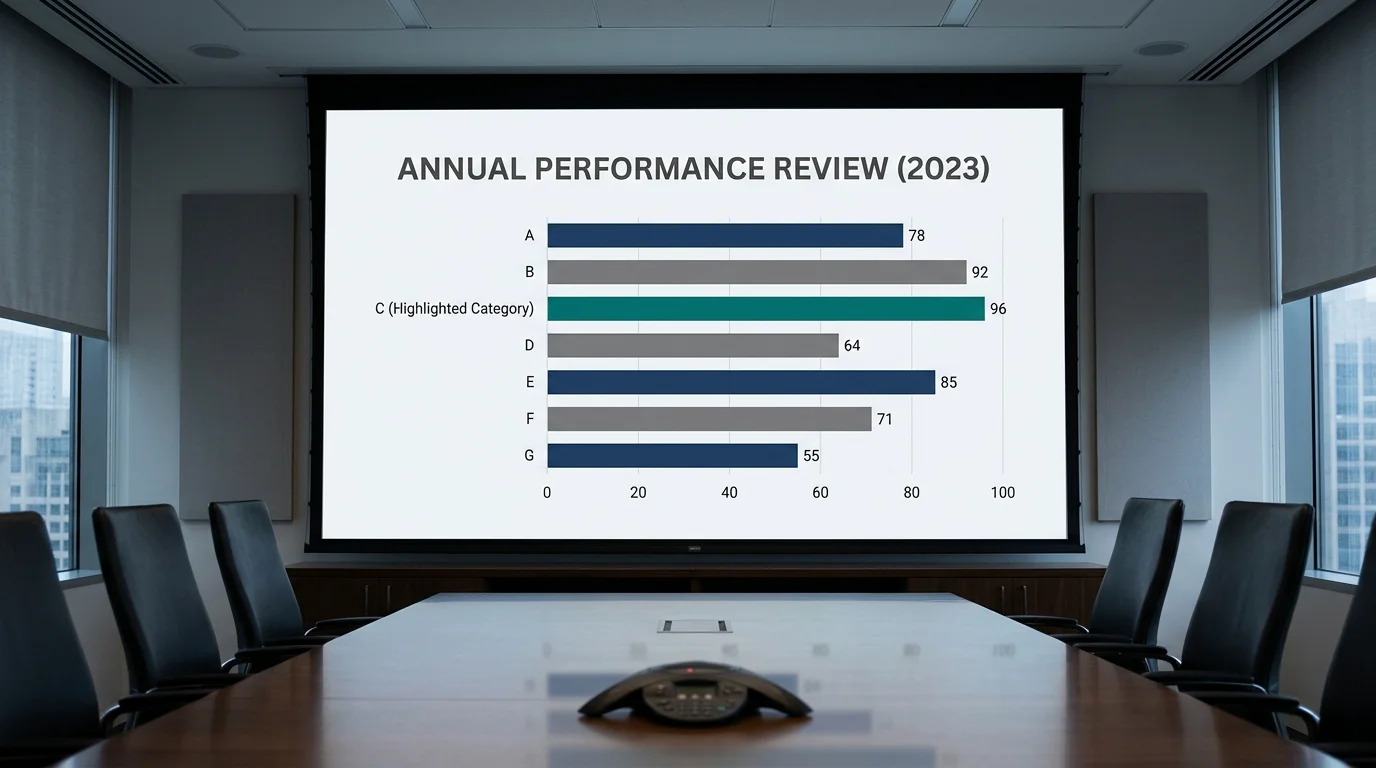
Visual restraint is not an aesthetic preference; it is a cognitive strategy. Experimental work published in a decision-making study shows that analytics visualizations improve the comprehensibility of raw data and reduce perceived task complexity, precursors to faster interpretation.
McKinsey decks apply this through a tight design system. A limited palette of two or three colors plus grey, sans-serif type in a few consistent sizes, and charts that occupy full slides when the insight warrants it. Labels sit directly on the chart, legends disappear, and color highlights only what matters.
Because the thinking must show as clearly as it reads, we treat design as part of the argument rather than a coat of paint. If you want the reasoning behind that choice, our guide on Why visuals work explains how disciplined visuals accelerate comprehension and buy-in.
A Step-by-Step Workflow to Build Your Deck
Start with the answer, not the slides. Write your single-sentence recommendation first, then test it against the SCR storyline to confirm it resolves a real complication. Only after the logic holds do you open a slide editor.
Next, draft your action titles as a standalone sequence. Read them top to bottom; if they tell a complete story without the body content, your structure is sound. Then attach one chart or visual to each title, choosing the simplest form that proves the point.
Finally, pressure-test for MECE gaps and trim anything that does not advance the decision. For a persuasive close that asks for a specific commitment, our Pitch & proposal template gives you a proven arc from problem to recommendation.
Choosing Your Starting Point
You can build a consulting-grade deck three ways. Each carries different trade-offs in frameworks, design quality, and format flexibility. The table below compares the options against the criteria that matter for board-ready work.
| Approach | Strategy frameworks | Board-level design | Multi-format support |
|---|---|---|---|
| Blank deck from scratch | None built in; you assemble each one manually | Depends entirely on your design skill | Rebuilt separately for each tool |
| Generic template packs | Limited or generic frameworks | Visual polish varies widely | Often a single format only |
| Our slide systems | Consulting-grade frameworks such as SWOT, PESTEL, Porter's Five Forces, and the Business Model Canvas | Board-ready visuals designed to accelerate decisions | Built for PowerPoint, Keynote, and Figma |
The strongest starting point combines proven frameworks with refined design from the outset. That combination is precisely what we assemble, so you spend your energy on the argument rather than the scaffolding.
Bringing It Together
Building McKinsey-style strategy slides is less about imitation and more about adopting a discipline: lead with the answer, structure with the Pyramid Principle and MECE, carry one message per slide, and let clean visuals prove each point. Apply these principles consistently and your decks stop describing analysis and start driving decisions. The next presentation you prepare is the ideal place to practice, one action title and one clear chart at a time.
Take action with Deckadence
You now know what separates a deck that earns a decision from one that gets filed away. The gap between knowing and doing, however, is usually time, and preparing a board-level strategy presentation under deadline is where most good thinking gets diluted. That is the exact moment where a ready structure earns its keep.
We build consulting-grade slide systems that pair strategy frameworks with board-ready design across PowerPoint, Keynote, and Figma. Explore our McKinsey strategy slides (presentation PPT) to start from a proven storyline, apply action titles with confidence, and turn complex analysis into a clear, persuasive case that moves decision-makers to act.
Frequently Asked Questions
What is the Pyramid Principle in a McKinsey deck?
It is a top-down structure that leads with your main recommendation, then supports it with three to five arguments, each backed by evidence. Barbara Minto developed it at McKinsey. It mirrors how busy executives prefer to receive information.
What does MECE mean and why does it matter?
MECE stands for Mutually Exclusive, Collectively Exhaustive. It means your categories do not overlap and together cover the whole problem. This discipline keeps your analysis complete while avoiding repetition that dilutes your argument.
What is an action title?
An action title is a full sentence that states the slide's takeaway rather than a generic label. Instead of "Market share," you write "We lost three points of share despite higher marketing spend." It lets skimming readers follow your case through the titles alone.
How many messages should one slide carry?
Exactly one. Working memory holds only a few items at once, so a slide with competing ideas forces the audience to pick what to focus on. When you have two points, build two slides and preserve white space.
Do I need design skills to create board-ready slides?
Strong design helps, but you do not have to start from zero. Our consulting-grade slide systems combine established frameworks with board-ready visuals for PowerPoint, Keynote, and Figma, so you can focus on the argument rather than the formatting.