How much time does a senior executive give a single slide before deciding whether to keep reading? Often less than a minute. That constraint explains almost every design choice behind a consulting deck, and it is why reviewing our presentation strategy examples can shorten your own learning curve. A McKinsey-style PowerPoint presentation is engineered for one purpose: to make a complex recommendation understandable and defensible in the shortest possible time.
The method is not proprietary magic. It is a repeatable system of structure, logic, and restraint that any team can apply. Once you understand the underlying rules, you can reproduce the clarity without copying a single slide, adapting the approach to board updates, investor pitches, and strategy reviews alike.
What Defines the McKinsey Presentation Style
When people search for a mckinsey presentation ppt, they usually want the reasoning system behind the slides, not just a template to fill in. The style rests on a few interlocking habits: the main conclusion appears first, every argument is grounded in data, and the visual design stays minimal so nothing competes with the message.
The style emerged from a practical need. Consultants had to communicate dense strategic analysis to leaders who had little time and high standards. The result favors structured thinking and logical coherence over persuasion through emotion. Each slide earns its place by proving one specific point, and anything that does not advance the argument is removed.

The Pyramid Principle: Lead With the Answer
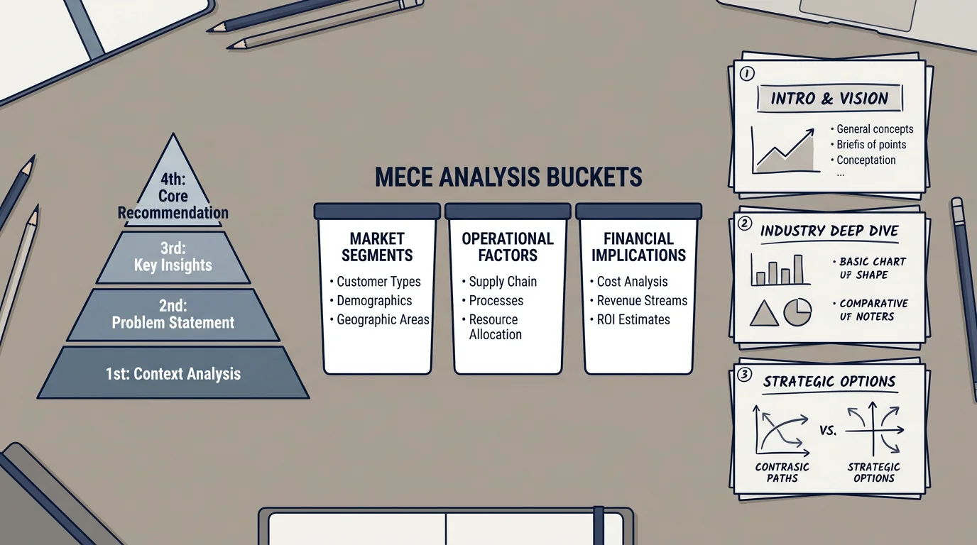
The backbone of the approach is the Pyramid Principle, a method for organizing ideas so the reader grasps them immediately. The idea is simple but counterintuitive: state your conclusion first, then support it with grouped arguments, then back each argument with evidence. Most people communicate the opposite way, walking through analysis before revealing the point.
The framework was developed by Barbara Minto, a former consultant, and set out in her book The Pyramid Principle, first published in 1987. Her core claim is that ideas are easiest to absorb when arranged as a pyramid beneath a single governing point. An earlier edition of the same work is archived by the Internet Archive, confirming how long the technique has shaped business writing.
In practice, this means the top of each slide states the takeaway, the middle presents two to four logically grouped reasons, and the base supplies the charts and figures. A reader who stops after the headline still leaves with your recommendation.
MECE Logic and the Opening Storyline
Structuring supporting arguments well is where MECE comes in. The acronym stands for Mutually Exclusive, Collectively Exhaustive: your categories should not overlap, and together they should cover the entire question. This test keeps an argument free of both redundancy and blind spots, which is exactly what a skeptical board looks for.
The opening of a strong deck usually follows the SCQA sequence: Situation, Complication, Question, Answer. Minto's own site describes this as the SCQ Framework for identifying the question already forming in the reader's mind. A common shorthand variant, Situation-Complication-Resolution, drops the explicit question and moves straight to the recommendation.
If you are preparing a high-stakes strategy review, this is the stage where structure decides success. Our presentation strategy examples show how a tight SCQA opening frames a decision before a single number is shown.
Designing Board-Ready Slides
Once the logic holds, design becomes an act of subtraction. McKinsey-style slides typically carry one idea, one visual, and a headline written as an insight rather than a label. A full-slide chart is preferred to a cluttered grid, because attention should land on the trend that matters.
Data visualization is now a core management skill, not a specialist task. As Harvard Business Review argues in its work on effective charts, being able to communicate through visuals has become a must-have capability for leaders facing overwhelming amounts of data. The practical rule is signal over noise: identify the single finding a slide must prove, then engineer the chart around it.
A Practical Build Sequence
Rather than opening PowerPoint and formatting first, consultants build the argument on paper or in a rough outline, sometimes called a ghost deck. Only when the storyline survives scrutiny does visual production begin. This order prevents beautiful slides that say nothing.
The table below compares three common ways teams approach an executive deck, mapped against the criteria that matter most for board audiences.
| Approach | Built-in strategy frameworks | Board-ready design | Ready-to-use formats |
|---|---|---|---|
| Building from a blank file | None; you supply all logic | Depends entirely on your skill | None |
| Generic free templates | Rarely; mostly cosmetic layouts | Limited and inconsistent | Usually one format |
| Our strategy slide systems | SWOT, PESTEL, Porter's Five Forces, Business Model Canvas | Board-level visuals designed to accelerate decisions | PowerPoint, Keynote, and Figma |
We built our strategy frameworks and slide systems so the thinking shows as clearly as it reads, which removes much of the manual assembly this method usually demands.
Common Mistakes to Avoid
The most frequent error is treating the style as a look rather than a logic. Copying the minimalist aesthetic while burying the conclusion on slide fifteen defeats the entire purpose. A clean slide that fails to state its point is still a failed slide.
A second mistake is overloading visuals. When a chart tries to prove several things at once, it proves nothing cleanly. Keep one message per slide, write the takeaway into the title, and let white space carry the rest. Finally, avoid the trap of decoration for its own sake; every element should earn attention by advancing the storyline toward a decision.
Bringing the Method Together
A convincing McKinsey-style presentation is the product of disciplined thinking made visible. Lead with the answer, group your evidence so it is mutually exclusive and collectively exhaustive, open with a clear situation and complication, and design each slide around a single proven point. Build the argument before you touch formatting, and treat restraint as a feature rather than a limitation. Applied consistently, these habits turn dense analysis into decisions, which is the only outcome an executive audience truly rewards.
Take action with Deckadence
You now understand the structure behind a board-ready deck. The remaining challenge is producing it under time pressure without rebuilding every framework and layout by hand. That is precisely the gap we set out to close for consultants, executives, and teams presenting strategy to decision-makers.
We combine consulting-grade frameworks, structured storytelling, and board-level design in formats built for PowerPoint, Keynote, and Figma. Explore our strategy presentation templates to turn complex ideas into clear, persuasive slides that move stakeholders to act.
Frequently Asked Questions
What is the Pyramid Principle in a McKinsey presentation?
It is a top-down method that places the main conclusion first, followed by grouped supporting arguments and then the underlying data. Developed by Barbara Minto, it helps time-constrained executives grasp a recommendation before reviewing the detail. The structure keeps every slide anchored to a single governing point.
What does MECE mean and why does it matter?
MECE stands for Mutually Exclusive, Collectively Exhaustive. It ensures your supporting points do not overlap and together cover the whole question, which removes both redundancy and gaps. Board audiences trust arguments that pass this test because they appear logically complete.
Do I need PowerPoint specifically to build these slides?
No. The method is a logic system, not a software feature, so it works in any tool. Our strategy slide systems are built for PowerPoint, Keynote, and Figma, allowing you to keep the same structured approach whichever format your organization prefers.
How many ideas should a single slide contain?
One. Each slide should prove a single point stated in its headline, supported by one clear visual. Splitting multiple messages across dedicated slides preserves clarity and keeps the audience focused on the decision.
What should the opening of the deck accomplish?
The opening should frame the situation, surface the complication, raise the implicit question, and preview the answer, following the SCQA sequence. This gives the audience a reason to care and a roadmap for what follows. A strong opening sets up the recommendation before any data appears.