Consulting Presentation Structure: A Practical Guide for Teams
A consulting presentation structure should make the decision visible before the audience studies the evidence. It begins with a clear recommendation, then organizes the logic, proof, and next steps around that decision. For teams building a repeatable workflow, our presentation slide systems can help turn that discipline into reusable layouts.
The purpose is not to make every deck look identical. The purpose is to help executives understand what is happening, why it matters, what you recommend, and what they need to decide. A well-structured deck also works as a standalone document when readers review it without a presenter.
What must a consulting presentation structure accomplish?
Imagine that a senior decision-maker has only five minutes to review your deck. The presentation must communicate its central answer quickly, show why that answer is credible, and make the requested action clear. If the recommendation appears only after several pages of background, the audience may never reach the most important point.
Consulting presentations therefore function as decision documents, not merely as visual support for a live talk. Each page should contribute to an argument. The sequence should reduce uncertainty rather than reproduce the order in which the analysis was completed.
A practical structure answers five questions:
- What decision or outcome is this presentation designed to support?
- What is the current situation, and what has changed?
- What evidence supports the recommended direction?
- What trade-offs, risks, or limitations should decision-makers understand?
- What must happen next, who owns it, and by when?
This standard changes how you build the presentation. You begin with the decision and work backward toward the evidence. You remove information that does not strengthen the recommendation, even when that information was difficult to collect.
Start with the decision, then build the storyline
Consider a market-entry presentation. The goal is not simply to describe market size, competitors, customer segments, and regulations. The real objective may be to secure approval for entering one market through a specific route within a defined period.
Write that decision in one sentence before opening PowerPoint. A useful objective includes the audience, the choice under consideration, and the action you want after the meeting. For example, you might write, “The executive team should approve a phased entry into Market A, subject to a 90-day validation program.”
From there, apply a top-down logic. The Pyramid Principle places the governing answer first, followed by the arguments that support it, then the evidence beneath each argument. A university thesis describing consulting methodology connects this approach with SCQA framing, MECE arguments, and supporting facts.
Use the frameworks for different jobs rather than treating them as interchangeable:
- SCQA, Situation, Complication, Question, Answer, helps define the context, the disruption, the question that matters, and the response.
- SCR, Situation, Complication, Resolution, is useful when the presentation needs to move directly from the current state to a recommendation.
- MECE, Mutually Exclusive and Collectively Exhaustive, helps organize supporting arguments without unnecessary overlap or important gaps.
- The Pyramid Principle controls the hierarchy between the answer, supporting arguments, and detailed evidence.
For example, a strategy recommendation might follow this logic:
- Situation: The company has grown through its established channels for several years.
- Complication: Growth in those channels is slowing, while a new segment is expanding.
- Question: Which growth option offers the best balance of value, feasibility, and risk?
- Answer: Enter the new segment through a focused pilot, then scale after validating demand and economics.
The frameworks do not replace judgment. They help you test whether the argument is complete, whether each section has a distinct role, and whether the evidence supports the answer rather than merely decorating it.
Write the ghost deck before designing slides

Before you create charts, icons, or polished layouts, draft a ghost deck. This is a bare-bones version of the presentation containing the proposed slide titles and only the notes needed to explain each page.
The ghost deck tests the logic of the story before design decisions make weak reasoning harder to see. Read the titles in sequence. They should show the movement from context to problem, from problem to analysis, and from analysis to recommendation.
Each title should express an implication rather than a topic. “Customer analysis” identifies a subject, but it does not tell the audience what to conclude. “Three customer segments account for most near-term adoption potential” gives the page a clear job.
These are action titles. They help a reader understand the argument by scanning the headlines alone. They also force you to confirm that every slide has one central message. Our guide to action titles in PowerPoint explains how to turn descriptive headings into decision-oriented statements.
Use the ghost deck to identify four common problems:
- Two slides repeat the same argument using different wording.
- A conclusion appears before the evidence needed to support it.
- A section introduces a question that the deck never answers.
- A slide contains several unrelated insights that should be separated.
Do not treat the ghost deck as a final outline that cannot change. Analytical work may change your recommendation. The advantage is that you can revise the story quickly before investing time in formatting, chart production, and detailed sourcing.
Use a five-part deck architecture
For many strategy recommendations, a five-part structure provides a reliable starting point. The exact slide count depends on the audience, the decision, and the amount of evidence required, but the roles remain clear.
- Title slide: State the subject, audience, date, and purpose with minimal visual noise.
- Executive summary: Present the recommendation, the main reasons, and the decision or action required.
- Body analysis: Develop the supporting arguments through data, comparisons, frameworks, and interpretation.
- Recommendations and next steps: Translate the analysis into actions, ownership, timing, and expected outcomes.
- Appendix: Preserve detailed calculations, methodology, additional data, and answers to anticipated questions.
The executive summary is not a table of contents. It should stand alone as a compressed version of the complete argument. Keep the situation and complication brief, then give most of the available space to the resolution, supporting rationale, and decision request.
A useful summary may contain three bold claims, each followed by concise evidence. The claims should explain what is happening, why the recommendation is appropriate, and what the organization should approve. Write this page after the analysis is complete, even though it appears near the beginning of the deck.
Longer presentations may also include a contents page or section dividers. Use them when they improve navigation, not as substitutes for a coherent storyline. Our Boston Consulting Group presentation structure resource can help you study how sections, summaries, and decision-oriented slides work together.
The body of the deck should follow the supporting arguments in a deliberate order. Lead with the point that matters most to the decision, then address feasibility, economics, risks, or implementation as the audience needs them. Avoid placing all background pages first simply because they were completed first.
Make every slide prove one message
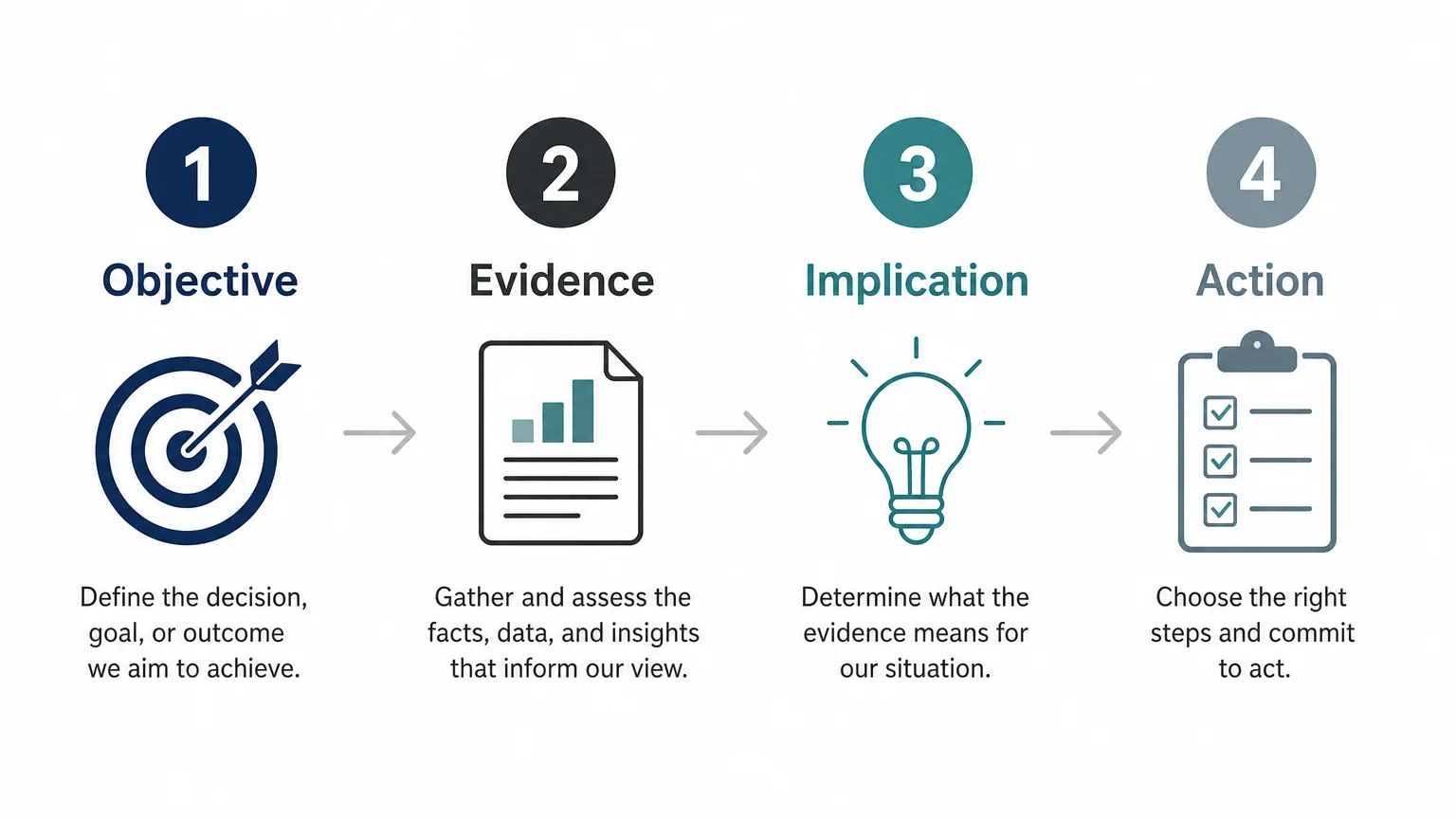
What should a reader understand from each page after a few seconds? The answer should be visible in the title and supported by the slide body.
Use one message per slide. A chart, table, diagram, or text block should exist because it helps prove that message. If an element does not support the title, remove it, move it to the appendix, or create a separate slide.
Strong slides connect four components:
- Action title: A complete sentence that states the implication.
- Proof point: The data, observation, comparison, or analysis that supports the implication.
- Visual hierarchy: A clear distinction between the headline, evidence, labels, and source note.
- Decision relevance: A visible connection to the recommendation or question being addressed.
Source important numbers directly on the slide. Include the source name, period, definition, and relevant assumptions when they affect interpretation. A number without context can create false precision, especially when different sources use different market definitions or time periods.
Use the simplest visual that communicates the point. A bar chart may clarify a comparison more effectively than a complex dashboard. A process diagram may explain ownership more clearly than several paragraphs. The design should reduce interpretation time rather than compete with the analysis.
Guidance on structuring a presentation emphasizes the role of audience needs, logical hierarchy, and the Minto Pyramid Principle. These ideas are useful even when the final presentation is highly visual, because design cannot compensate for unclear reasoning.
Use restrained formatting throughout the deck. Set consistent title positions, margins, fonts, colors, page numbers, and source notes. Highlight only the evidence that matters most. If every number uses an accent color, the audience cannot distinguish the critical number from background information.
Our McKinsey presentation PowerPoint examples provide another reference point for action-led titles, evidence-focused layouts, and disciplined visual structure. Use examples as thinking aids, not as templates to copy without adapting them to your audience and decision.
Finish the main storyline with recommendations and next steps. Each recommendation should begin with an action verb, identify the intended outcome, and connect to an owner or timing when those details are known. If the decision requires a sequence of actions, show the order and dependencies clearly.
The appendix should answer likely questions without interrupting the main narrative. Place detailed calculations, methodology, alternative scenarios, sensitivity analysis, additional data cuts, and supporting definitions there. A strong appendix demonstrates analytical depth while keeping the core story readable.
Before delivery, conduct three reviews. First, read only the action titles and check whether they tell a complete story. Second, inspect every claim and confirm that the supporting evidence is relevant and properly sourced. Third, review the deck as a busy executive would, removing repetition, vague language, and pages that do not help the audience decide.
How to structure your consulting presentation effectively
A reliable consulting presentation structure begins with the decision, not the slide design. Define the objective, frame the situation and complication, develop a top-down storyline, and test it in a ghost deck. Then build an executive summary, evidence-led body slides, clear recommendations, practical next steps, and an appendix that preserves essential detail. When every slide has one message and every message supports the decision, the presentation becomes easier to read, discuss, and act on.
Build clearer strategy presentations
Once the logic is sound, the next challenge is making the structure consistent across real presentation work. Reusable systems can help you move from a blank slide to a coherent narrative without losing the strategic thinking behind the deck.
Our library combines strategic frameworks, narrative structures, action titles, concise messaging, and board-ready visual design for consultants, agencies, executives, founders, and business leaders. Explore our strategy consulting resources to support clearer analysis and more persuasive decision communication.
Frequently Asked Questions
What is the basic consulting presentation structure?
The basic structure includes a title slide, executive summary, analytical body, recommendations with next steps, and an appendix. The sequence may change by use case, but the deck should lead with the answer and support it with relevant evidence.
What is the difference between SCR and SCQA?
SCR means Situation, Complication, Resolution, while SCQA adds a Question between the complication and the answer. SCR is useful for a direct recommendation storyline, whereas SCQA helps frame the question that guides the analysis.
How many slides should a consulting presentation contain?
There is no universal slide count. The main deck should contain enough pages to prove the recommendation clearly, while detailed analysis and anticipated questions can move to the appendix.
What makes an action title effective?
An effective action title states the slide’s conclusion or implication in a complete sentence. It should be specific enough that a reader can understand the main point without studying every element on the page.
Can presentation assets help apply this structure?
Yes, structured presentation assets can provide reusable layouts, narrative patterns, and framework references for consulting-style communication. Our library combines these elements for users who need to organize complex strategy and communicate decisions with greater clarity.