A recurring deck is not automatically a system. A useful presentation slide system connects the argument, repeatable slide roles, and visual rules, so each presentation can adapt without losing its logic. For board communication, our presentation frameworks for board decks offer a strategic starting point. Your content and decision context still determine the final sequence.
The distinction matters when teams reuse slides across meetings, audiences, or markets. A collection of attractive layouts supplies visual consistency, but a system also clarifies what each slide needs to communicate and how evidence supports the recommendation. That structure can reduce the temptation to copy an old deck wholesale or add slides simply because a familiar layout is available.
What does a presentation slide system contain?
Consider a leadership team preparing a strategic recommendation. Its system needs more than a title page and a chart style. It needs a clear sequence of ideas, a repeatable way to present evidence, and rules that let several contributors assemble a coherent deck.
A practical system usually combines four elements:
- Narrative spine: The sequence of context, central question, analysis, recommendation, and next steps.
- Slide roles: Reusable formats for explaining a choice, comparing options, showing a trend, or defining a roadmap.
- Visual rules: Consistent typography, spacing, colors, chart treatment, and source notes.
- Reuse guidance: Instructions on which sections are standard, which are optional, and how to adapt content for an audience.
These parts work together. A consistent color palette cannot repair a story that hides its recommendation. A sound narrative can still be difficult to follow if charts, labels, and layouts change unpredictably from slide to slide.
Start with the decision, then design the slides

Begin by writing the decision your audience needs to make. Then arrange the evidence that supports it, rather than choosing layouts before the argument is clear.
One approach is to make each slide title state its takeaway, with evidence beneath it. For example, replace “Market overview” with “Smaller customers drive most of the category’s recent growth.” The new title tells readers what to notice before they interpret the chart.
A 2023 exploratory study with 108 engineering students found lower perceived cognitive workload for participants who designed assertion-evidence slides than for those using traditional PowerPoint templates. The researchers found no impact on motivation, self-efficacy, or understanding, so treat the result as a limited finding rather than a universal performance claim. The 2023 student study supports testing message-led structures, not assuming that one format suits every audience.
For consulting-style recommendations, our McKinsey strategy slides page explores how structured logic can carry through to the presentation. Use the underlying reasoning as a guide, then adapt the language and evidence to your organization.
Build reusable modules without making every deck identical
Reuse works best when the team standardizes the purpose of a slide, not every slide’s appearance. A comparison, a trend chart, and a recommendation each ask the audience to do something different. They should feel related, but they do not need identical layouts.
Divide the deck into a stable opening, self-contained content modules, and a closing. Keep essential context and the core recommendation in the main sequence. Add optional modules for different audiences, such as a market detail for a product team or a financial scenario for a board discussion.
Research-based slide-design guidance recommends reducing cognitive overload by limiting unnecessary information and using visuals to support the spoken message. In practice, establish a small set of layout patterns, then select the pattern that fits each message. Our resource on action titles in PowerPoint explains one way to make the takeaway visible in the slide heading.
Modularity also needs boundaries. If contributors can change every color, chart style, and heading convention, the system provides little consistency. If nothing can change, it may not fit a different audience or presentation purpose. Set a small number of fixed rules, and define where adaptation is appropriate.
Choose the system type that matches your work
Before selecting materials, identify the problem you need to solve. Several related tools use slides, but they address different parts of presentation work.
- Strategy and narrative system: Connects frameworks, storyline, slide roles, and visual rules. This fits teams communicating analysis, strategic choices, or recommendations.
- Template collection: Provides reusable layouts and visual components. It can help when the argument is already clear and the main need is a consistent presentation format.
- Presentation management system: Organizes and maintains approved slide content across a team. It addresses storage, discovery, and version control rather than deciding the strategic storyline.
- Authoring software: Supplies the workspace for building and presenting slides. The tool alone does not determine whether the deck’s argument is clear or its evidence is well organized.
These categories can overlap, but they are not interchangeable. A team struggling to explain a strategy needs help with narrative and analysis, not just a larger collection of layouts. A team with a settled storyline and scattered files may need stronger content organization.
Our library brings together strategic-thinking materials, frameworks, narrative structures, and slide systems. The materials are built for PowerPoint, Keynote, Figma, and more, though you should confirm the requirements of any specific asset and your workflow before adopting it.
Check readability and platform fit before rollout
A system should make it easier to follow the content, not merely make slides look related. Check whether a person can identify the main point from a slide title, read labels on a shared screen, and distinguish chart series without relying on color alone.
The University of California, Santa Barbara library guide recommends large, legible text and suggests 24-point type or larger for presentation slides. Treat that as a practical starting point, then test the actual deck at the size and distance your audience will use. UCSB library guidance also advises organizing content with headings and layouts and focusing each slide on one concept.
Next, check compatibility in the presentation tools your team actually uses. Confirm how fonts, charts, images, and layouts behave when a file is opened or shared. Do not assume that a material built for a platform is editable in every workflow or behaves identically across applications.
For a small team, test a few representative slides in the tools and display settings you use most. For a larger organization, include contributors from different functions. Their feedback can reveal whether the rules support real work or create unnecessary friction.
Put the system into practice with a simple workflow
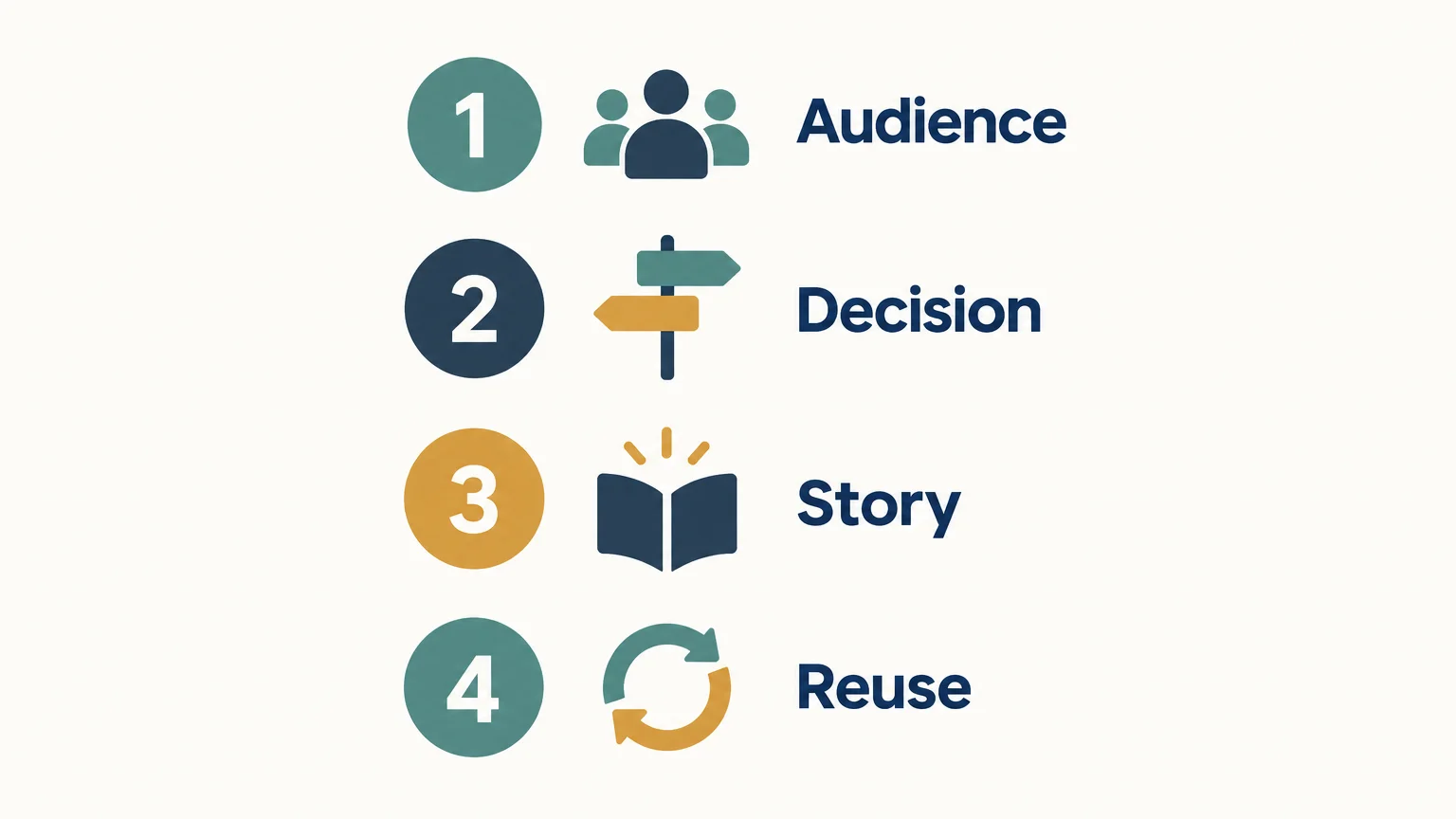
To put a system to work, test it on a real deck rather than designing a large library first. This sequence keeps the effort focused:
- Define the audience. Note what they already know, what they need to understand, and what decision is expected.
- Write the answer. State the recommendation or main conclusion before creating slide titles.
- Map the story. Choose the evidence, analysis, and transitions needed to support the answer.
- Select slide roles. Match each point to a suitable format, such as a comparison, trend, process, or roadmap.
- Test and refine. Review the deck for logic, legibility, consistency, and compatibility in your working environment.
Keep the first version deliberately small. A focused set of useful slide roles is easier to review and maintain than a library built before the team understands its needs.
If you are shaping a consulting narrative before choosing slide layouts, our consulting presentation structure resource can help you organize the storyline. Our strategy guide also covers more than 15 frameworks and includes guidance for selecting among them. Choose a framework because it fits the question, not because it is already in the template.
Make the system serve the argument
A useful presentation system connects strategic logic, slide roles, and visual consistency without making every deck look or sound the same. Start with the audience and decision, test the sequence on a real presentation, and confirm readability and platform fit before wider use. Keep the rules that improve clarity, and revise those that get in the way.
Bring structure to your strategic presentations
When complex analysis needs to become a clear presentation, a repeatable system can connect the thinking to the story and its visuals. Our library is designed for consultants, agencies, executives, and business leaders who need to organize ideas and communicate decisions with clarity.

Explore our visual strategic-thinking library for board-ready frameworks, narrative structures, and slide systems. Our presentation materials combine strategic frameworks, structured storytelling, action titles, concise messaging, and refined visual design. They are built for PowerPoint, Keynote, Figma, and more. Explore our strategy and presentation materials.
Frequently Asked Questions
What is a presentation slide system?
It is a repeatable approach that connects a presentation’s story, slide roles, and visual rules. Unlike a set of layouts alone, it also guides how content supports the audience’s decision.
How is a slide system different from a template?
A template typically provides layouts and visual styling. A slide system also helps organize the argument, select suitable slide roles, and keep a deck coherent as it changes.
How many layouts should a slide system include?
There is no fixed number. Begin with the slide roles your team repeatedly needs, such as a recommendation, comparison, trend, process, and roadmap, then add layouts when a real use case requires them.
How can I make slides easier to follow?
Give each slide one main point, use a title that states the takeaway, and include evidence that directly supports it. Check text size, contrast, and chart labels in the setting where people will view the presentation.
What resources can help me create a strategic slide system?
Start by clarifying the decision, story, and evidence before choosing layouts. Deckadence’s strategic-thinking materials combine frameworks, narrative structures, action titles, concise messaging, and slide systems for professional presentations.